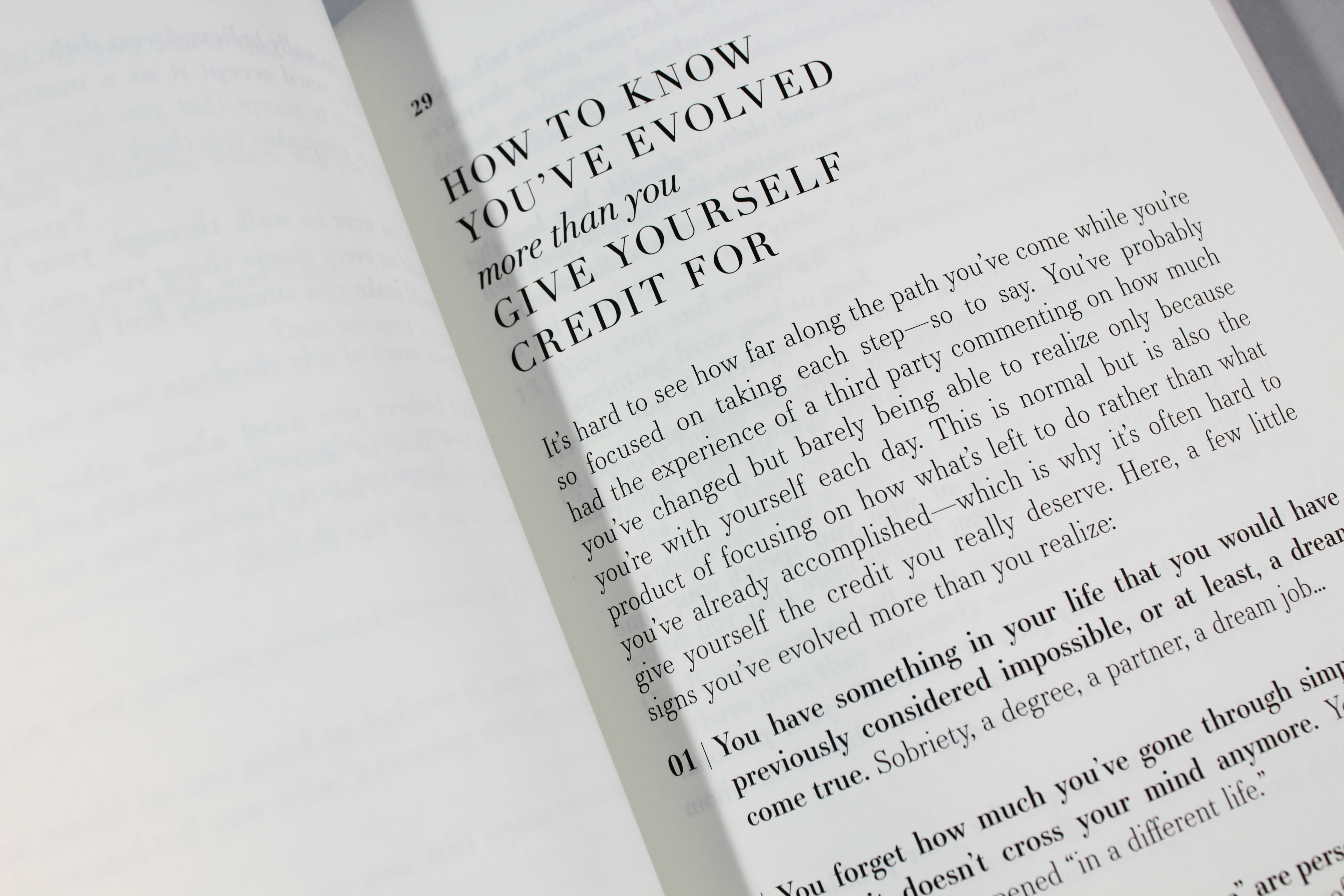
5 Secrets of Stylish Headers with Tiny Text
Tiny text in stylish headers has become a fascinating design trend that has many designers and makers interested. Their eye-catching, understated design draws attention to them in a distinctive way. The simplicity, accuracy, and creative grace of these headers are their secrets. Now let's explore the subtleties and procedures that go into creating these fashionable headers and see how they are created.
Stylish Headers with Tiny Text
Accuracy in typography
The careful choice and use of typography are crucial for tiny text headings. Selecting a font is crucial; sans-serif typefaces that are modern and elegant frequently go well with the minimalist look. Clear-cut typefaces with easily recognizable characters are great for creating a professional appearance. More characters can fit in a smaller space without sacrificing readability when using narrow or condensed typefaces, which are especially useful for tiny headers.
But readability is still an important consideration. The text needs to remain readable despite its small size. It's an art form to strike a balance between readability and font size. It entails determining the ideal font size, where the content is both easily comprehensible and tiny enough to provide the desired aesthetic
White Space and Equilibrium Conditions
The success of small text headers is greatly dependent on the thoughtful use of whitespace. It's important to consider how the text interacts with the surrounding area in addition to its size. Enough whitespace surrounds the tiny text, highlighting its significance and establishing a general sense of harmony across the design. These headers usually have a minimalist design, with the text taking up very little of the available space. The text becomes the main focus despite its small size because of the intentional use of negative space to bring attention to it. Also adding to the overall visual attractiveness is the contrast between the tiny text and the surrounding whitespace.
The palette of colors and contrast
The choice of color is yet another crucial component in creating attractive headers with tiny text. The key here is contrast. It is easier to see text when you use a color scheme that makes the text stand out against the background. The tiny text may stand out and give depth and visual appeal to the design by using bold, contrasting colors.
But it's important to practice moderation. The beauty of small text headers can be undermined by the use of too complicated color schemes or an excessive amount of vivid colors, even if contrast is crucial. Frequently, the text may be emphasized successfully without overpowering the reader using a straightforward color scheme and one or two accent colors.
Design Elements' Subtlety
The small text's visual impact can be increased by adding subdued design elements surrounding it. The text can be complemented by delicate borders, subtle shadows, or simple pictures to give the header more depth and refinement. Rather than taking center stage, these components should help the content stand out more in the layout.
Additionally, uniformity in design is essential. The small text and the stylistic components that accompany it should complement the design's overall concept and objective. This cohesiveness guarantees that the components function in unison to express the desired meaning or arouse a certain feeling.
Adaptive and Usable Design
Usability or accessibility shouldn't be compromised when small text is used in headers. For example, responsiveness on different devices is important in web design. On a desktop, text that seems attractively small may become unreadable or lose its effect on smaller devices. To preserve the desired aesthetic and readability, testing and optimizing for various screen sizes is crucial.
Adequacy of contrast and readability is also mandated by accessibility requirements. All users, especially those with visual impairments, must be able to view the tiny text while maintaining artistic beauty.
Conclusion
Elegant headers with tiny text capture the spirit of minimalist design, which depends on balance, accuracy, and minute details to draw the eye of the spectator. Their charm is a result of their thoughtful color selections, strategic use of whitespace, careful typographic selection, modest design components, dedication to responsiveness and accessibility, and thoughtful design work. Learning to create these headers requires you to strike a careful balance between appearance and usefulness. When used with deliberate execution, they function as potent design components that make an impact that lasts while remaining sophisticated and elegant.